Colour by Nature from Farrow & Ball
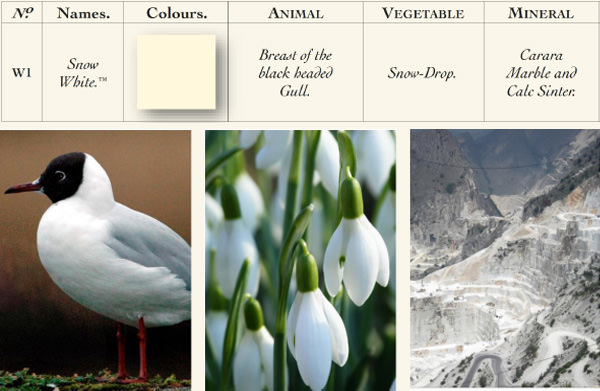
No.W1 SNOW WHITE
As white as snow
Snow White is a wonderful alternative to pure white, which works very well on wood and ceilings in combination with other colours. The secret behind its warmth and reflective power, which turns even the darkest rooms into an oasis of relaxation, lies in the yellow pigments added to the colour.
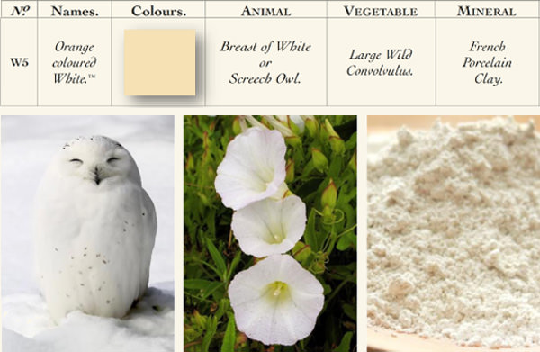
No.W5 ORANGE COLOURED WHITE
A warm cream shade with a hint of orange
Fresh, yet warm - Orange Coloured White is a colour that is particularly suitable for north-facing rooms. The red pigments of this natural shade create a soft and warm ambience without appearing overly feminine.
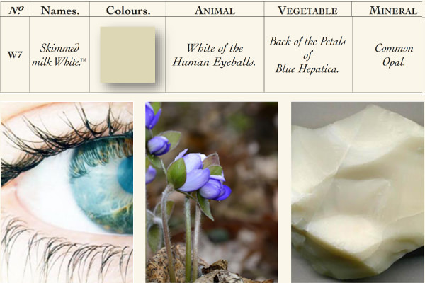
No.W7 SKIMMED MILK WHITE
A soft, muted shade of white
This muted shade of white impresses with its extraordinary softness. Regardless of whether it is a modern interior design with a border in Snow White or a wood finish with dark accents - Skimmed Milk White gives the room the necessary cosiness.
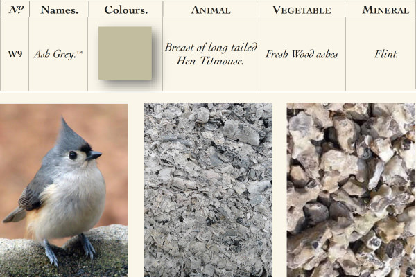
No.W9 ASH GREY
A green-grey that invites you to relax
Our Ash Grey is suitable for any room, especially when combined with the slightly warmer colour Skimmed Milk White. For a contemporary look, Ash Grey can also be used together with a border in the lighter Snow White. Thanks to the greenish nuance of the shade, the colour appears stronger in natural daylight and greyer in darker places.
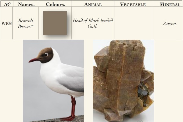
No.W108 BROCCOLI BROWN
A calm, greenish brown
Broccoli Brown is a calm stone tone that blends effortlessly with natural materials such as weathered wood or stone slabs. As this colour is characterised by its rather muted colour intensity, it is ideal for the walls and ceilings of study rooms to create an optimal working atmosphere.
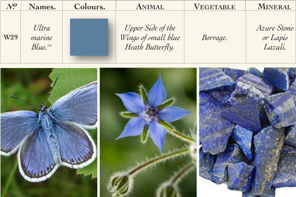
No.W29 ULTRA MARINE BLUE
A rich sea blue
Ultra Marine Blue has been one of our favourite colours since the 18th century. At that time, it was used to visually enlarge small rooms. In modern rooms, it looks best on cupboards. In a kitchen, it can be paired with a kitchen island in bold Scotch Blue to create a stunning effect.
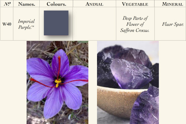
No.W40 IMPERIAL PURPLE
A strong violet
This colour can be used to give dining rooms and other private rooms a glamorous and inviting appearance. Used sporadically, this colour enhances the appearance of otherwise neutral rooms. For a soft and playful touch, we recommend combining it with Snow White and Ash Grey.
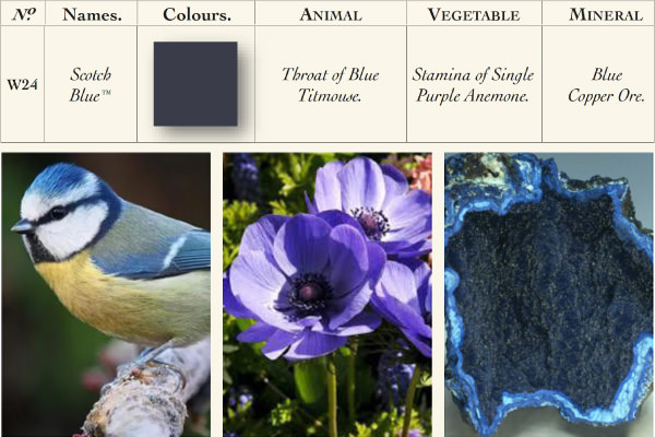
No.W24 SCOTCH BLUE
A deep dark blue
This majestic shade of blue adds a touch of luxury to any room and is ideal for designing rooms where guests are received. Scotch Blue is particularly effective with wood in Ash Grey - this colour scheme creates a perfect retreat to relax at the end of the day.
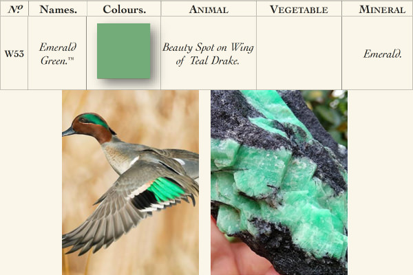
No.W53 EMERALD GREEN
A pure, vibrant shade of green
This jewel tone is both cheerful and elegant, making it suitable for any room. It is an excellent addition to multi-coloured design concepts (for example with Lake Red and Ultra Marine Blue), where it provides the necessary harmony between the different shades.
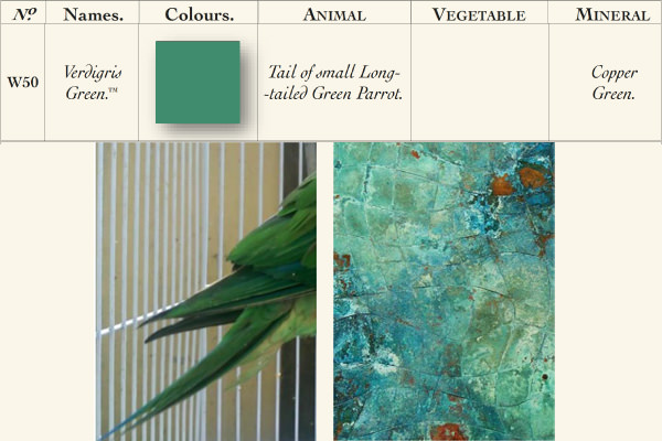
No.W50 VERDIGRIS GREEN
The colour of copper patina
Although this colour appears cheerful and lively at first glance, it retains a certain elegance when used indoors. The strong colour mixture has a more intense effect when combined with lighter shades. Especially with the colours Dutch Orange or Lake Red, Verdigris Green lets a room shine in all its glory.
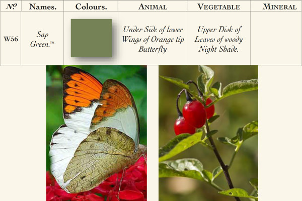
No.W56 SAP GREEN
A green directly from nature
In combination with Broccoli Brown and Duck Green, this shade of green reflects the true colours of nature, creating a calming, cosy atmosphere. As a colour for corridors or terraces, it creates a powerful ambience.
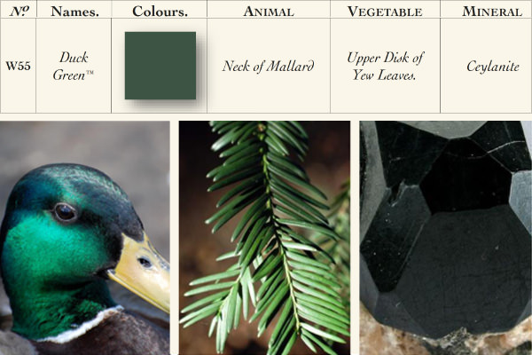
No.W55 DUCK GREEN
A refined and powerful shade of green
Duck Green takes its name from the dark green plumage of a drake and serves as a wonderful example of the splendour of nature's colours. Bold without being overpowering - in modern rooms, this colour is a perfect alternative to grey tones and looks cosy and inviting in combination with wood in Deep Reddish Brown.
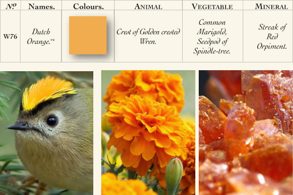
No.W76 DUTCH ORANGE
A cheerful, vibrant shade of orange
This bright orange brings new life to any room. Used on its own, it creates a warm atmosphere, whereas in combination with Verdigris Green and Skimmed Milk White it achieves a more dynamic effect. Dutch Orange offers a special eye-catcher with a border in Duck Green.
No.W92 LAKE RED
A confident red
Whether this colour is more red or pink is in the eye of the beholder - nevertheless, it always radiates vitality and joie de vivre. It is perfect for small rooms, as it looks wonderful on walls as well as on wood, ceilings and as an interior paint for cabinets.
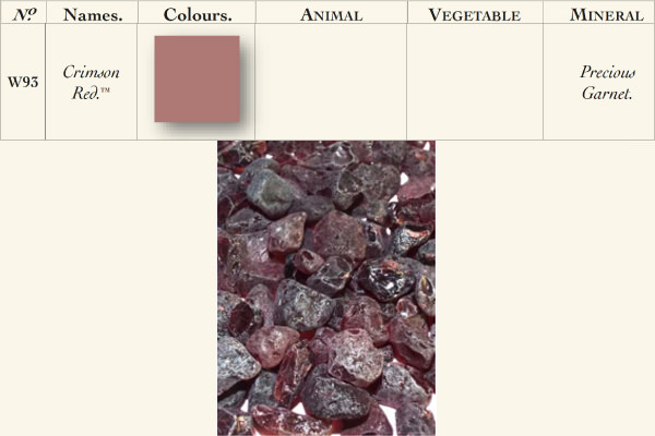
No.W93 CRIMSON RED
An intense, warm shade of pink
Especially on wood and in combination with Skimmed Milk White, Crimson Red creates a calm ambience and inviting rooms. With dark shades such as Scotch Blue, on the other hand, the romantic effect of the colour is brought to the fore, giving the room a glamorous glow.
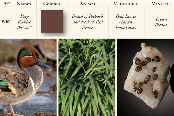
No.W101 DEEP REDDISH BROWN
A natural earth tone
Intensely coloured, warm and inviting - Deep Reddish Brown was once favoured in country houses to highlight the woodwork of back staircases. And even today, this colour continues to set off walls, doors and borders to great effect.